
Mobile Responsive Websites
Mobile Responsive Website Design

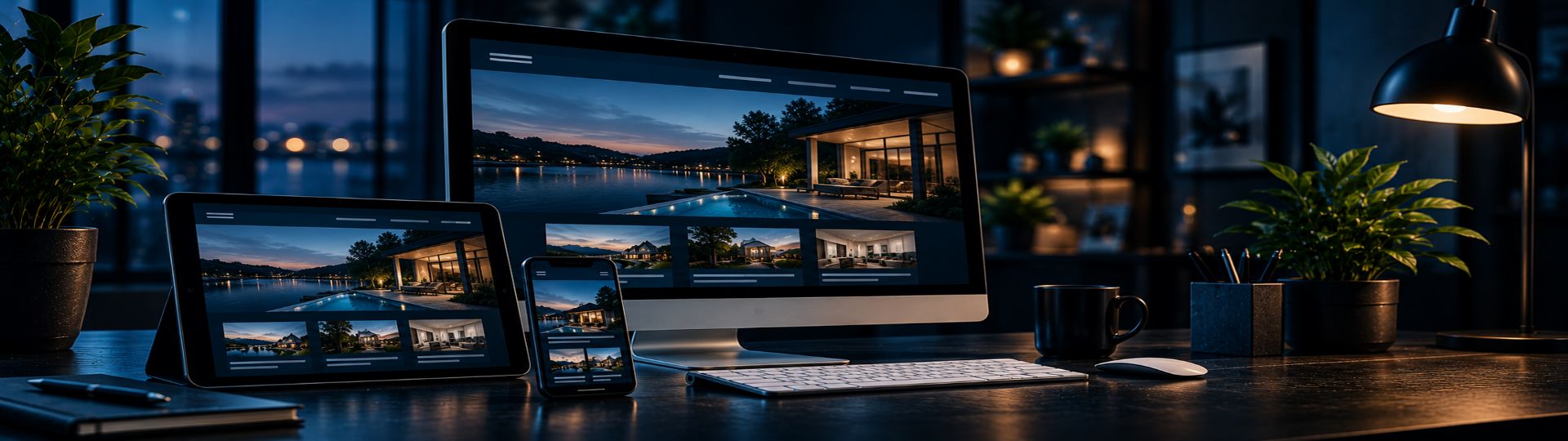
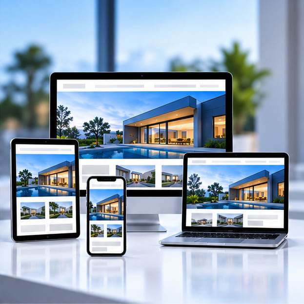
One Website.Every Screen.

Responsive website design that gives your customers a professional, easy-to-use experience whether they visit from a desktop computer, tablet or mobile phone.
Your Customers Aren't All Using The Same Screen.
Responsive By Design

Your Customers Aren't All Using The Same Screen.

A modern website has to work wherever your customers find it. A page that looks great on a desktop computer can quickly become frustrating if navigation, text, images or contact options don't adapt properly to a smaller screen.

Halstead Design builds responsive websites that adjust to the visitor's device while maintaining the branding, content and functionality of the full website.

Responsive design isn't a separate mobile website. It is one website built intelligently enough to provide a strong experience across a wide range of screen sizes.

LET'S BUILD A BETTER WEBSITE
Designed For Real Users

Responsive Design Is More Than Making Things Smaller.

Every part of the page should remain clear, usable and purposeful as the available screen space changes.

Mobile-Friendly Navigation

Navigation adapts to smaller screens so visitors can quickly reach important services, pages and contact information.
Readable Content

Typography, spacing and content widths adjust so visitors aren't pinching, zooming or fighting to read the page.

Flexible Layouts

Columns, cards, images and page sections reorganize naturally as screen dimensions change.

Touch-Friendly Actions

Buttons, links and navigation controls are designed to remain easy to use on touch-screen devices.

Easy Mobile Contact

Phone numbers, forms and calls to action stay accessible when a potential customer is ready to contact you.

Consistent Branding

Your company maintains the same professional identity across desktop, tablet and mobile experiences.
Designed Around The Visitor, Not The Device.
The Complete Experience

Designed Around The Visitor, Not The Device.

The goal isn't simply to pass a mobile-friendly test. Responsive design should make the entire website easier to use, helping visitors find information and take action without thinking about the technology behind the page.

Clear Navigation

Important pages and services remain easy to reach at every screen size.

Smart Content Flow

Sections reorganize in a logical order rather than simply shrinking.

Flexible Visuals

Images and media scale appropriately without overwhelming smaller screens.

Strong Calls To Action

Contact options remain visible and useful when customers are ready to respond.

Learn More
Our Approach

Responsive From The Beginning.

Mobile usability works best when it is considered during the design and development of the entire website rather than patched in afterward.

Understand The Content

Determine which information, services and actions are most important to visitors throughout the website.

Build Flexible Layouts

Create page structures that can adapt naturally instead of relying on one fixed desktop arrangement.

Responsive Development

Build navigation, content, images, cards and interactive elements to respond across different screen sizes.

Refine The Experience

Review layouts at multiple sizes and refine spacing, stacking, readability and calls to action.
Website Design + Mobile

There Shouldn't Be A "Desktop Site" And A "Mobile Site."

Your website should be one connected experience. The content, branding and goals stay consistent while the presentation adapts to the screen being used.

That approach also makes the website easier to maintain. Content changes happen in one place rather than maintaining separate desktop and mobile versions of the same website.

Desktop Laptop Tablet Mobile Portrait Landscape
A Better Mobile Experience Supports The Whole Website.
Responsive Design + Organic SEO

A Better Mobile Experience Supports The Whole Website.

Website design, usability and organic search should not be treated as unrelated pieces. A responsive website creates a stronger foundation for visitors arriving from search engines, social media, referrals and direct visits.

Halstead Design can plan the website structure, content, responsive behavior and organic SEO together so the same site works toward the same business goals on every device.